
Claude Just Got Better at Charts and Visuals - Why This Update Matters
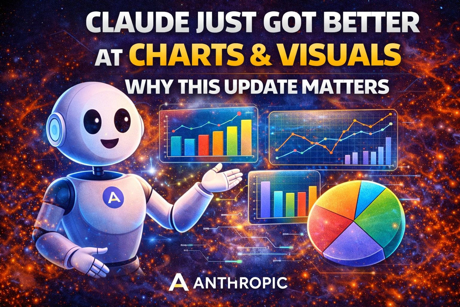
Anthropic just shipped one of the more useful Claude updates in a while: Claude can now create interactive charts, diagrams, and visualizations directly inside the conversation. On the surface, that may sound like a nice extra feature. But the bigger story is not really about charts alone. The bigger story is that Claude is becoming better at choosing the right format for an answer instead of defaulting to paragraphs every time.
That matters because a lot of real work is not best handled through text alone. If someone is trying to understand a trend, compare categories, explain a workflow, summarize a process, or communicate findings to other people, a chart or diagram is often a better tool than a long written answer. This update pushes Claude closer to that reality. It becomes less of a “text machine” and more of a tool that can help people think, analyze, and communicate more clearly.
In simple terms, Claude is getting better at showing, not just telling.
What actually changed
Before this update, Claude could already help explain information, summarize documents, reason through data, and create outputs through artifacts. That was already useful. But it still often meant the user had to imagine the visual structure themselves, ask for it separately, or move into another tool if they wanted a clearer presentation.
Now Anthropic is pushing something more direct. Claude can build visuals inside the chat itself. That means the chart, diagram, or visualization becomes part of the conversation instead of something that lives outside it. The user does not have to break the flow, switch to a spreadsheet tool, open a design app, or manually convert an answer into a visual later.
That is an important shift in product experience. The answer is no longer limited to words. Claude can respond in a way that fits the problem better.
And because the visual appears as part of the discussion, the user can keep iterating naturally. They can ask Claude to change the structure, simplify the labels, focus on one category, compare another variable, or reframe the explanation, all without starting over.
Why this matters more than it first sounds
At first glance, “Claude can make charts” may sound like the kind of product update that looks good in a demo but does not change much in practice.
But this one is more meaningful than that.
A huge amount of knowledge work involves translating complexity into something understandable. That is true in business, education, research, consulting, product work, operations, marketing, finance, and many other fields. The problem is often not a lack of information. The problem is that information is too dense, too spread out, too abstract, or too hard to explain quickly.
That is exactly where visuals help.
A line chart can make a trend obvious in two seconds. A bar chart can make a comparison feel clear immediately. A simple diagram can explain a process better than three paragraphs of description. A visual summary can help someone communicate to a manager, client, teammate, or audience much faster than a block of notes.
So this is not really about decoration. It is about making AI output more usable.
Claude becomes more valuable when it can turn a good answer into a clearer answer.
The deeper product shift: format intelligence
The real significance of this update is not just visual generation. It is what this suggests about Claude’s direction.
Anthropic appears to be moving Claude toward something we could call format intelligence. That means not only giving a smart answer, but giving that answer in the form that is most useful for the task.
That is a very important difference.
A lot of AI chat experiences still assume that if the model is intelligent enough, the answer can stay mostly text-based. But intelligence alone is not the whole story. The way information is presented matters too. The best answer in the wrong format can still feel slow, heavy, and hard to use.
This update suggests Anthropic understands that. Claude is being pushed toward an interface where the product is not only trying to think better, but also trying to present better.
That is what makes this feel like more than a visual feature. It feels like part of a broader attempt to make Claude more practical in real-world workflows.
Why charts and diagrams matter so much in real work
It is worth slowing down here, because this is where the update becomes easier to appreciate.
In day-to-day work, people constantly need to do things like:
explain changes over time
compare business results across categories
show how one variable affects another
describe a process with multiple steps
communicate priorities visually
summarize findings for people who do not want to read a long memo
turn analysis into something presentation-ready
Those tasks are not rare edge cases. They are normal, recurring parts of modern work.
That is why visuals matter so much. They help compress understanding. They also help reduce friction between “I know what the data says” and “I can explain this clearly to someone else.”
If Claude can now handle more of that inside the same conversation where the thinking is already happening, it becomes much more useful as a working tool.
Instead of using Claude only to get the explanation and then another app to turn that explanation into something presentable, users can stay in one place longer.
That saves time, but more importantly, it preserves context.
Why this could be especially strong for business users
This feature looks especially relevant for business and professional workflows because business communication often depends on structured clarity more than raw creativity.
Executives want fast summaries. Teams want quick comparisons. Managers want dashboards and patterns. Analysts want trends explained. Product teams want flows clarified. Consultants want insights that can be understood quickly. Marketers want something they can show, not just describe.
That is where Claude’s new visual capabilities could become especially helpful.
Imagine asking Claude to analyze a dataset, identify the main patterns, then immediately turn the result into a chart you can use to support the explanation. Or imagine using Claude to map a workflow, compare several options, or visualize a plan inside the same thread where the reasoning already happened.
That kind of workflow is much smoother than the older pattern of receiving text, copying it into another tool, and rebuilding the presentation manually.
The smoother the transition from reasoning to communication, the more useful the AI becomes.
This also helps education and learning
The value of this update is not limited to business users.
It could also be very useful for education, tutoring, and self-learning. A lot of people understand concepts much faster when they see them rather than just read them. This is especially true for patterns, relationships, comparisons, and sequences.
A student trying to understand a concept can benefit from a visual explanation immediately. A teacher or tutor can use charts or diagrams to simplify something that would otherwise feel abstract. Someone learning on their own can move from confusion to clarity much faster when the explanation is turned into a visual format.
That makes the update broader than a productivity feature. It also strengthens Claude as a learning tool.
If the product becomes better at deciding when a chart or diagram is the clearest answer, then it becomes better at teaching, not just responding.
Inline visuals vs artifacts
One subtle but important detail is the difference between these visuals and Claude’s existing artifacts model.
Artifacts are useful when the user wants something more durable and self-contained. They are better for building documents, tools, larger structured outputs, or things that feel like a separate deliverable. They are more like a workspace beside the conversation.
These new visuals feel different.
They are more immediate, more conversational, and more temporary in a good way. They are there to support understanding right now, at the point where the user is thinking through the issue. That makes them feel lighter and faster. Instead of building a full artifact, Claude can simply show the visual that helps clarify the answer and keep moving.
That distinction matters because not every workflow needs a persistent side product. Sometimes the user just needs to understand the situation better in the moment.
Artifacts help when you want something durable. Inline visuals help when you want clarity inside the flow of the conversation.
Together, these two modes make Claude more flexible and more complete.
Why this is also a competitive move
Anthropic is not doing this in isolation.
The broader AI market has been moving toward richer interfaces, stronger multimodal behavior, and more dynamic outputs. The competition is no longer just about who has the smartest model in the abstract. It is increasingly about who can give the most useful response in the most useful format.
That matters because users do not experience AI as a benchmark table. They experience it as a workflow.
And in a workflow, the interface matters. The output format matters. The ease of iteration matters. The ability to stay in one place and keep refining matters.
So this update is also part of a larger competitive trend. Anthropic is making Claude stronger not just in intelligence, but in usability.
That is a smart direction.
Because over time, product quality will matter as much as raw model quality in many real-world use cases.
Why this feels practical instead of flashy
One reason this update stands out is that it solves a real weakness of text-heavy AI interaction.
A lot of AI tools are still too wordy by default. They can be intelligent, but they often make users work too hard to extract the real meaning. When the answer is buried in several paragraphs, the user still has to do the mental translation into structure.
Charts and diagrams reduce that burden.
That is why this update feels practical rather than flashy. It is not trying to impress the user with a novelty for its own sake. It is trying to make explanations more efficient and more useful.
Most people do not need AI to produce more words. They need AI to help them get to understanding faster.
This update helps move Claude in that direction.
The challenge: usefulness depends on quality
Of course, the success of this feature will depend on execution.
Not every chart is helpful. Not every diagram is clear. A poor visual can confuse more than it explains. So the value here depends on whether Claude can create visuals that are actually well-structured, relevant, and easy to interpret.
The product also has to get the balance right. If it produces visuals too often, it may feel noisy. If it produces them too rarely, the feature may feel underused. If the visuals look good but do not capture the key idea properly, users will treat them as decoration rather than utility.
So while the direction is strong, the real test will be whether users feel that Claude is making the answer clearer, not just different.
That said, the direction itself is promising because it goes after a real need rather than a gimmick.
What this says about Claude’s future
This update also hints at a broader future for Claude.
If Anthropic continues developing Claude as a tool that can think, write, analyze, code, review, and now visualize more effectively, then Claude starts to become something closer to a general-purpose knowledge work environment.
That is important.
The most powerful AI products may not be the ones that only answer questions well. They may be the ones that help users move fluidly between different forms of work: reasoning, drafting, summarizing, comparing, visualizing, revising, and presenting.
This visual update fits that direction very well.
It suggests Anthropic sees Claude not just as a chatbot, but as a more complete work companion.
Final verdict
Anthropic’s new Claude visuals update matters because it pushes Claude beyond text-only interaction and into interactive visual explanation inside chat.
Claude can now create charts, diagrams, and other visuals directly in the conversation, adjust them as the conversation continues, and make the overall interaction more useful when a visual is the best way to explain something. That makes Claude stronger for analysis, planning, education, communication, and knowledge work more broadly.
The update may look small at first if you only think about it as “Claude can make charts.” But the real significance is bigger than that.
It shows Claude moving toward a better kind of intelligence: not just intelligence that can answer, but intelligence that can present, clarify, and communicate more effectively.
The simplest takeaway is this:
Claude is getting better at showing its thinking, not just describing it.
And that is a meaningful step forward.